Trending Articles
Dropshipping Fulfillment Tips that Ensure the Success of the 2021 Holiday Season
8 mins reading
 10 claps
How to Promote Your Dropshipping Store with Instagram Stories & Reels
8 mins reading
10 claps
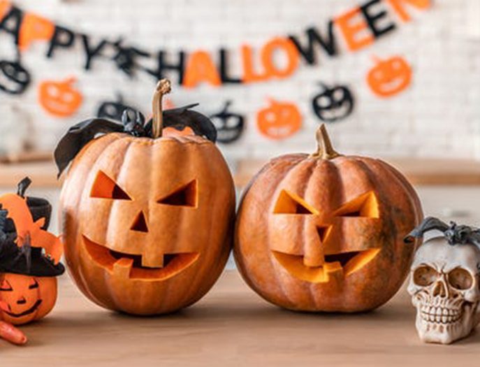
Best Products for Seasonal and Festive Dropshipping
7 mins reading
10 claps